10 web designer tips for UX and mobile design
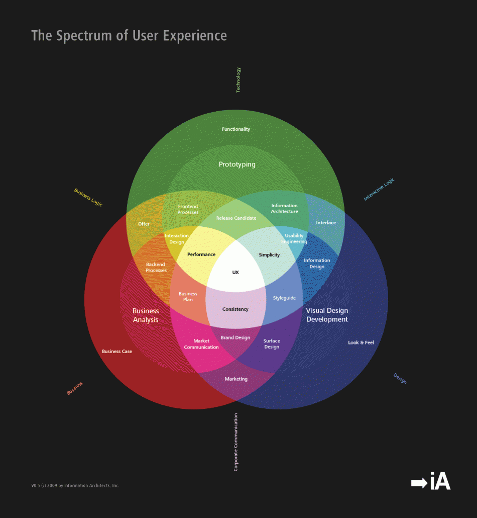
User experience (UX) in almost any industry website is primarily about enhancing the user (prospect, lead or customers) journey and experience, through to your ideal goal.
Whether that be enhancing engagement, purchase, clicks, content consumption, etc., in the end any UX web designers goal is to reduce the friction to enhance the users experience.
Chatting with a local Vancouver web designer, he shared his insights after 15 years of designing websites, that many website designer ignore this, and businesses with a large digital component seem to fail in UX centred design.
Our belief is that UX design is a topic that’s always existed, but never brought to the forefront in commercial mainstream application…let alone an area of web design that was truly understood.
The lack of UX design by most web designers and website design companies we foresee was an effect of competitiveness to differentiate…creatively, versus approach design from data-driven insights, and mold creative around the data.
Website owners in Vancouver, and almost anywhere for that matter, have to reduce this online friction with their website traffic – both in design and user flows, but also across platforms and devices as mobile. At the forefront should be the necessity to reduce all barriers as possible.
Now that mobile is here, where on average website receive +20% of traffic from mobile devices, any entrepreneur running an online business with an ecommerce component must take into account the mobile commerce piece of their business, and the impact UX web design can have on the mobile experience.
Sure the rules of UX design on desktop will stem across mobile and tablets, but also an understanding how users interact and consume content on your site across devices and their role in the customer purchase behavior must be taken into account. Thus, to help those Vancouver designers and freelance web designers trying to help their clients grow business online, the following are 10 simple tips for improving the UX on mobile formats.
1. USE LARGE FIELDS
It greatly improves the UX if your users are able to easily click on the forms without accidentally pressing the wrong page element. Often brands will design large CTAs but fail to give the same screen space to their form fields, when in reality both need to be simple to click.
Bonus: Retina Ready? Also ensure the design embraces retina readiness. Countless times I see Vancouverites on the Skytrain, pinching their screens to read or look at an image, only to see its a blurred or distorted image. Where the finer pixel-level details are crucial to the product imagery, a retain-ready website addresses this to ensure if a user zooms in on their iPhone to take a detailed look at the product, the high resolution image quality is not lost.
2. GIVE USERS THE RIGHT TOOLS FOR THE JOB
The best example of this is when filling in fields that require numerals, such as telephone numbers, as sites should show the user the numeric keypad so that they can easily tap in the digits.
In general sites still display the normal keypad for telephone numbers, which means the user has too press an extra button to find the small numeric keys. This is another rather obvious UX point of which surprisingly few site owners take notice.
To give a different example, H&M’s otherwise excellent app presents you with a text keypad when entering your date of birth, when in fact a numerical keypad or even a dropdown menu would be of more use.
In contrast, when searching for a date on Expedia’s site it gives you this handy calendar view. Obviously these are different use cases but it demonstrates the fact that you need to give users the best tools for the task in hand.


3. USE GPS
If the form requires the user’s location, such as a setting a default retail outlet, then GPS makes the process incredibly simple.
Thanks to Google Maps nearly all smartphone owners will have used GPS at some point, so it makes sense to use it as a shortcut where relevant.
4. ALIGN LABELS VERTICALLY
Due to the limited space on mobile screens, horizontal label alignment should be avoided as it can cause a number of UX issues. In order to fit a label beside a form field you have to reduce the size of both elements, which causes the design to appear cluttered and makes the fields difficult to click.
The difference is highlighted in these forms from Debenhams and New Look, with the former far easier to use.


5. MAKE CALLS-TO-ACTION AS LARGE AS POSSIBLE
This is seems like an obvious point and yet so many retailers still expect their users to press a CTA the size of a pinhead in order to submit the form.
I’ve covered this topic in more detail in a post detailing eight tips for designing mobile CTAs, but the main points to note are that CTAs should:
- Be at least 44×44 pixels.
- Have plenty of white space around them to prevent erroneous clicks.
- Use a colour that’s distinct from the rest of the page elements.
Following these simple rules makes it far easier for users to submit forms and greatly reduces the potential for any friction. For example, just check out the difference between Topshop and Walmart…


6. CONDENSE INTO A SINGLE PAGE IF POSSIBLE
Again this ties in with the previous point, but some of the best mobile forms that I’ve come across have been condensed down into a single screen.
This both allays any concerns that the form is going to take ages to fill in and also reduces the chances that slow 3G signal will slow the process down between pages.
Office Depot is a great example of this as its guest checkout only requires the card details, address, phone number and an email address before you can confirm the payment. This makes the process feel extremely short and should help reduce the amount of dropouts.

7. PASSWORDS
Security is a major concern on mobile so it’s important to mask passwords in case somebody is peering over the user’s shoulder, however this does cause problems when people are unable decipher what they’ve entered and might be unsure if they’ve managed to press the correct keys.
In order to get the best of both worlds many sites now display the last character before altering it to a bullet point after a short delay.
8. SIMPLIFY THE DESIGN
When a website designer creates mobile forms, they should consider what the user will be trying to achieve, ideally based on behavioural data.
It’s likely that mobile users will have different aims than desktop visitors, so it might be feasible to strip out certain functions in order to simplify the design.
For example, Expedia’s mobile flight search tool has very few fields compared to the desktop version as mobile users are potentially less likely to need all the different filtering options at the initial search phase.
Expedia desktop version

9. AVOID OPTIONAL FIELDS
The overall strategy for mobile form design should be to strip out any unnecessary elements and simplify the process for your users.
Therefore it’s a good idea to do away with any optional fields, as unless it’s compulsory then nobody is going to waste their time filling it in anyway.
10. USE A PROGRESS BAR
If it’s not possible to reduce a form to one screen then it’s a good idea to use a progress bar to inform users how many pages they are going to have to click through.
People don’t like the unknown and users are less likely to become impatient if they know how many stages there are in the process.


